---
updatedAt: 2026-08-20T13:54:54.000Z
agentTools:
  projectIndex: https://developer.paze.com/public/llms.txt
---

# Paze®   Overview

<HTMLBlock>{`

<section class="auto-hero">
  <h1>Welcome!</h1>
  <p>

    Welcome to Paze&#174, the first of its kind digital wallet for online checkout. Paze is built for
    scale with over 150M+ (and growing) debit and credit cards pre-loaded by
    banks and credit unions. Empower your customers by offering Paze at
    checkout.
  </p>
</section>
`}</HTMLBlock>

<br />

<HTMLBlock>{`
<div class="video-container">
  <div class="video-embed-field-provider-wistia video-embed-field-responsive-video">
    <iframe
      width="854"
      height="480"
      frameborder="0"
      allowfullscreen="allowfullscreen"
      class="wistia_embed"
      src="https://fast.wistia.com/embed/iframe/hpifnp1i40?autoPlay=1"
    ></iframe>
  </div>
</div>

<style>
.video-container {
  display: flex;
  justify-content: center;
}
</style>
`}</HTMLBlock>

***

<HTMLBlock>{`
<br><br>
<div class="paze-section">

  <div class="paze-header">
    <h2>Merchants Initiation Flows</h2>
    <p>Customize your Paze implementation to fit your checkout flow</p>
  </div>

  <div class="paze-phones">

    <div class="paze-col">
      <img
        class="paze-phone-img"
        src="https://files.readme.io/8ac97181d15eede3e427844be772adb1978601181d0c88731fafa46131b7cbe0-Buttoncheckout.svg"
        alt="Paze product mockup"
      />
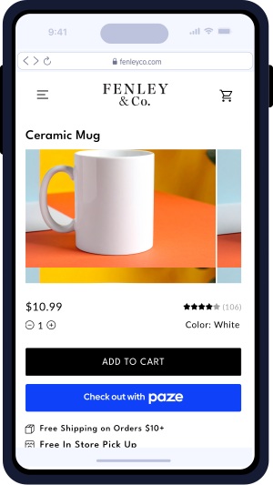
      <h3>Button Initiated Checkout</h3>
      <p>Integrate a Paze button on your product, cart and checkout page</p>
    </div>

    <div class="paze-col">
      <img
        class="paze-phone-img"
        src="https://files.readme.io/ec1fb1837cfcf5ea12e4c5a75c35755733e16812064e0901f261f93f6457a5e2-autoi.svg"
        alt="Paze checkout mockup"
      />
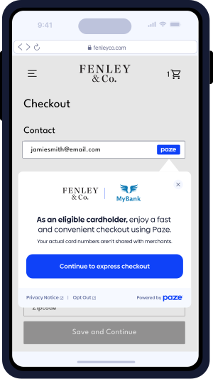
      <h3>Auto Initiated Checkout</h3>
      <p>Automatically launch Paze at checkout once an eliglbe customer types in email or mobile number.</p>
    </div>

  </div>

</div>
`}</HTMLBlock>

<br />

<br />

<HTMLBlock>{`
<div class="paze-section">

  <div class="paze-header">
    <h2>Checkout Flows</h2>
    <p>Implement the checkout flow that fits you best.</p>
  </div>

  <div class="paze-phones">

    <div class="paze-col">
      <img
        class="paze-phone-img"
        src="https://files.readme.io/e19a57ec95858c855f866af02a9553fb4073169901c69d332846f0010502ab6c-rp.svg"
        alt="Review & Pay mockup"
      />
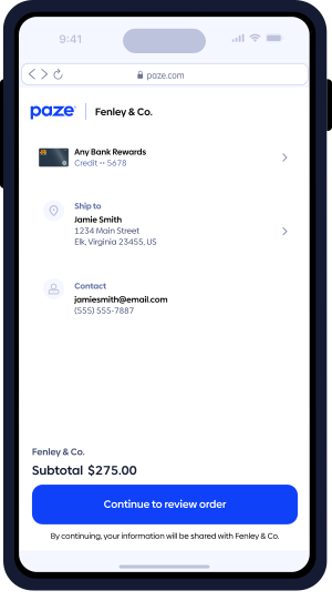
      <h3>Review & Pay</h3>
      <p>

        Customers can select an available<br/>
        card and review their order before<br/>
        completing the purchase.
      </p>
    </div>

    <div class="paze-col">
      <img
        class="paze-phone-img"
        src="https://files.readme.io/5792d728d30d03047dc881e5085ff2331e7d9b4f6e00d452017a2976cba09789-ep.svg"
        alt="Express Pay mockup"
      />
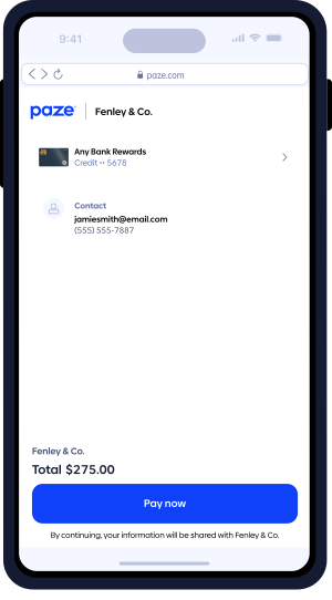
      <h3>Express Pay</h3>
      <p>

        Customers can complete their<br/>
        purchase directly from the product<br/>
        page.
      </p>
    </div>

  </div>

</div>
`}</HTMLBlock>

<br />

***

<HTMLBlock>{`

<section class="section">
  <div class="feature">
    <div class="feature-img">
      <img
        src="https://files.readme.io/d3736b8886b56501b6cb75b5669bbad7d54a7084af2b3b0cc92f7592197a53de-passkey.svg"
        alt="Checkout form identifying customer by email"
      />
    </div>
    <div class="feature-text">
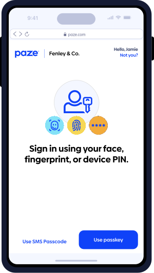
      <h3>Fast & secure identity verification, right in flow.</h3>
      <p>

No passwords, usernames, or extra steps – customers skip signups and jump straight into checkout.        </p>
    </div>
  </div>
</section>
`}</HTMLBlock>

<HTMLBlock>{`

<section class="section" style="margin-top:-100px;">
  <div class="feature reverse">
    <div class="feature-img">
      <img
        src="https://files.readme.io/10b756680b3cb01cac32a24a4b4a165f60ba6e6ac4df0005ef58c4f5fad40032-cards.svg"
        alt="Phone showing Paze checkout dialog"
      />
    </div>
    <div class="feature-text">
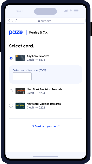
      <h3>Preloaded cards 
appear like magic </h3>
      <p>

Eligible cards show up ready to use – no digging, typing, or customer hand-holding required.        </p>
    </div>
  </div>
</section>
`}</HTMLBlock>

<HTMLBlock>{`

<style>
  /* ==========================
     Base layout + typography
  ========================== */
  header#content-head {
    display: none;
  }
  
  .field-description hr, .markdown-body hr {border-bottom: 1px solid #84E2F7;}

  html,
  body {
    overflow-x: hidden !important; /* Kill horizontal scroll at viewport edge */
  }

  /* ==========================
     Hero
  ========================== */
  .auto-hero {
    max-width: 1200px;
    margin: 32px auto 55px auto;
    text-align: center;
  }

  .auto-hero h1 {
    font-size: 40px !important;
    font-weight: 700 !important;
    margin: 0 0 24px !important;
    color: #2b2bee;
  }

  .auto-hero p {
    margin: 0 !important;
    font-size: 19px !important;
    font-style: normal !important;
    font-weight: 400 !important;
    line-height: 28.8px !important;
  }

  .auto-hero-img {
    display: flex;
    justify-content: center;
  }

  .auto-hero-img img {
    max-width: 100%;
    height: auto;
  }

  /* ==========================
     Generic sections
  ========================== */
  .section {
    padding: 0 40px;
    margin: 0 auto;
    position: relative;
    overflow: visible;
  }

  .section h2 {
    text-align: center;
    font-size: 36px !important;
    font-style: normal !important;
    font-weight: 900 !important;
    line-height: 43.2px !important;
    letter-spacing: -1px !important;
    margin-bottom: 24px !important;
  }

  .section-intro {
    text-align: center;
    max-width: 700px;
    margin: 0 auto 60px;
  }

  p.section-intro {
    font-size: 24px !important;
    font-style: normal !important;
    font-weight: 400 !important;
    line-height: 120% !important;
  }

  /* ==========================
     Feature rows (phone + text)
  ========================== */
  .feature {
    display: flex;
    align-items: center;
    justify-content: flex-start; /* no extra flex spacing */
    gap: 0;
    margin-bottom: 20px;
    position: relative;
    overflow: visible !important; /* let purple bar escape */
  }

  .feature.reverse {
    flex-direction: row-reverse;
  }

  .feature-img,
  .feature-text {
    padding: 0;
  }

  .feature-img {
    flex-shrink: 0;
  }

  .feature-img img {
    display: block;
    max-width: 525px;
    height: auto;
    border-radius: 24px;
    margin-left: -10px;
    padding: 120px;
  }

  .feature-text {
    width: 300px;
    max-width: 100%;
  }

  /* Text hugged tighter when phone is on the LEFT */
  .feature .feature-text {
    margin-left: -9% !important;
  }

  /* Text hugged tighter when phone is on the RIGHT */
  .feature.reverse .feature-text {
    margin-right: -11% !important;
  }

  .feature-text h3 {
    font-size: 20px !important;
    font-style: normal !important;
    font-weight: 700 !important;
    line-height: 28px !important;
    letter-spacing: -0.1px !important;
  }

  .feature-text p {
    font-size: 15px !important;
    font-style: normal !important;
    font-weight: 400 !important;
    line-height: 21px !important;
    letter-spacing: -0.1px !important;
  }

  /* ==========================
     Purple blobs behind features
  ========================== */
  .feature::before,
  .feature::after {
    content: "";
    position: absolute;
    top: 50%;
    width: 360px;
    height: 220px;
    background: #eef0ff;
    transform: translateY(-50%);
    z-index: -1;
  }

  .feature::before {
    left: -160px;
    border-radius: 0 90px 90px 0;
  }

  .feature::after {
    right: -80%;
    width: 100%;
    border-radius: 90px 0 0 90px;
  }

  /* ==========================
     Paze phone sections
  ========================== */
  .paze-section {
    background: #f4f6fb;
    border-radius: 20px;
    border: 1px solid #e3e6f0;
    padding: 64px 56px;
    max-width: 1250px;
    margin: 0 auto;
  }

  .paze-header {
    margin-bottom: 48px;
  }

  .paze-header h2 {
    font-size: 28px;
    font-style: normal;
    font-weight: 600;
    line-height: 120%; /* 33.6px */
    margin: 0 0 10px;
    color: #1f2743;
  }

  .paze-header p {
    font-size: 20px;
    font-style: normal;
    font-weight: 400;
    line-height: 120%; /* 24px */
    margin: 0;
    color: #4a5067;
    max-width: 600px;
  }

  .paze-phones {
    display: flex;
    justify-content: center;
    gap: 100px;
  }

  .paze-col {
    text-align: center;
  }

  .paze-phone-img {
    width: 260px;
    height: auto;
    margin-bottom: 28px;
    display: block;
    filter: drop-shadow(0 18px 40px rgba(0, 0, 0, 0.25));
  }

  .paze-col h3 {
    font-size: 22px;
    font-weight: 700;
    color: #1650ff;
    margin: 0 0 10px;
  }

  .paze-col p {
    font-size: 15px;
    color: #4b5267;
    line-height: 1.45;
    max-width: 260px;
    margin: 0 auto;
  }

  /* ==========================
     Medium / desktop down
     Stack phone + text earlier
  ========================== */
  @media (max-width: 1190px) {
    .section {
      padding: 0 24px;
    }

    .feature,
    .feature.reverse {
      flex-direction: column;
      align-items: center;
      text-align: center;
    }

    .feature-img img {
      max-width: 420px;
      padding: 90px;
      margin-left: 0;
    }

    .feature-text {
      width: auto;
      max-width: 440px;
      margin: 24px auto 0;
    }

    .feature .feature-text,
    .feature.reverse .feature-text {
      margin-left: 0 !important;
      margin-right: 0 !important;
    }

    /* Remove blobs so they can't overlap */
    .feature::before,
    .feature::after {
      display: none;
    }

    .paze-phones {
      gap: 64px;
    }
  }

  /* ==========================
     Responsive tweaks (phones)
  ========================== */
  @media (max-width: 768px) {
    .section {
      padding: 0 16px;
    }

    .feature-img img {
      width: 220px;
      padding: 80px;
    }

    .feature-text {
      max-width: 360px;
      margin: 16px auto 0;
    }

    /* Stack the two phone columns */
    .paze-phones {
      flex-direction: column;
      align-items: center;
      gap: 40px;
    }
  }

  /* ==========================
     ReadMe container overrides
  ========================== */
  .SuperHubDoc-article3ArTrEavUTKg,
  #content-container,
  .rm-Markdown,
  .rdmd-html,
  .section {
    overflow: visible !important; /* Let purple bars escape ReadMe wrappers */
  }

  .ContentWithOwlbot-content2X1XexaN8Lf2 {
    -webkit-box-flex: 1;
    -ms-flex: 1 1 auto;
    flex: 1 1 auto;
    min-width: 0;
    overflow-x: hidden;
  }
</style>
`}</HTMLBlock>

![]()