---
updatedAt: 2026-09-08T13:21:02.000Z
agentTools:
  projectIndex: https://developer.paze.com/public/llms.txt
---

# Overview

<br />

<HTMLBlock>{`
    
  <section class="auto-hero">
    <h1>Merchant Messages</h1>
    <p>

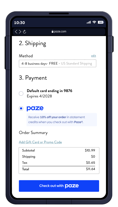
Paze&#174 Messaging displays promotional messages (for example, “Save 10% off your order by checking out with Paze&#174”) at key moments in the shopping and checkout journey. Messages are rendered by Paze  when an active offer exists.
    </p>
</section>
`}</HTMLBlock>

<HTMLBlock>{`

</script><style>wistia-player[media-id='0ae4ovpgr9']:not(:defined) { background: center / contain no-repeat url('https://fast.wistia.com/embed/medias/0ae4ovpgr9/swatch?autoPlay=true&loop=true&muted=true'); display: block; filter: blur(5px); padding-top:46.88%; }</style> <wistia-player media-id="0ae4ovpgr9" aspect="2.1333333333333333"></wistia-player>
`}</HTMLBlock>

<br />

<br />

<HTMLBlock>{`
    <div style="margin-top:-15px !important;" class="auto-hero-img">
     
`}</HTMLBlock>

<HTMLBlock>{`

</br>
<section class="section">
  <h2>Message placement on the Merchant Site</h2>
  <p class="section-intro">

   Merchants control placement. You choose where the message container appears while Paze configures message content and when it displays or expires.
  </p>
  </br>
  <p class="section-intro">

    Offer messages can be displayed on multiple merchant-controlled surfaces. Integration is consistent across pages, but placement varies by page context.
  </p>
</section>
`}</HTMLBlock>

<br />

<HTMLBlock>{`

<section class="section" style="margin-top:-100px;">
  <div class="feature reverse">
    <div class="feature-img">
      <img
        src="https://files.readme.io/cbe147c7b5995e3386cee52ea9cbb5db84ca0d8496932daa9d1f44eb5d47aa10-mobile_messaging_productDetails_413x727.png"
        alt="Phone showing preloaded cards"
      />
    </div>
    <div class="feature-text">
      <h3>Product Details Page</h3>
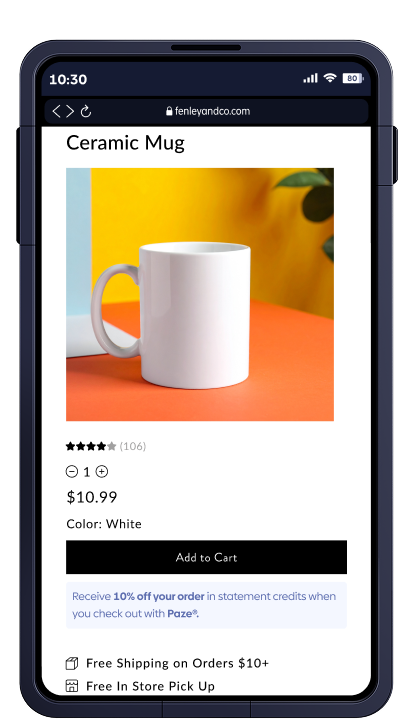
      <p>

        Messaging placed near the purchase decision aides customers in understanding the value of using Paze before adding an item to their cart.
      </p>
    </div>
  </div>
</section>
`}</HTMLBlock>

<HTMLBlock>{`

<section class="section" style="margin-top:-100px;margin-bottom:-50px;">
  <div class="feature ">
    <div class="feature-img">
      <img
        src="https://files.readme.io/6e4606b01af28bf0ef095c6ca003e3e1e9287d2b39eb425d9aa3ed658765a6ce-mobile_messaging_cart_75pct_413x727.png"
        alt="Phone showing Paze checkout dialog"
      />
    </div>
    <div class="feature-text">
      <h3>Cart</h3>
			</br>
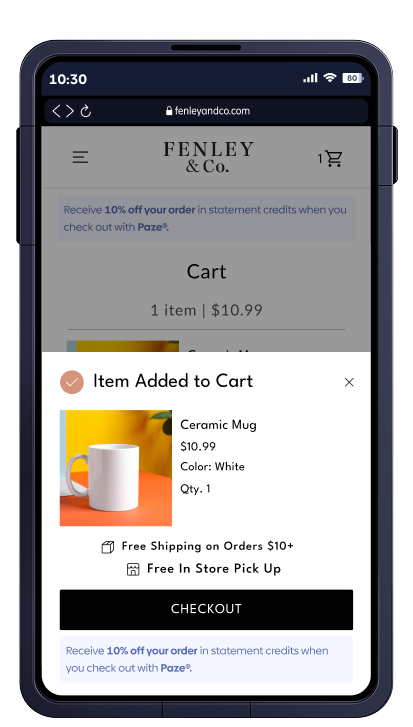
    	<p>Messaging reinforces the benefit of choosing Paze before checkout begins.</p>
			</br>
			
    </div>
  </div>
</section>
`}</HTMLBlock>

<HTMLBlock>{`

<section class="section" style="margin-top:-100px;">
  <div class="feature reverse">
    <div class="feature-img">
      <img
        src="https://files.readme.io/82bebefc848e2ac2b6c8fa4bbf072665dd433f7f17fbdecc17b5f5d946c653a8-mobile_messaging_checkout_413x727.png"
        alt="Phone showing biometric authentication prompt"
      />
    </div>
    <div class="feature-text">
      <h3>Checkout</h3>
      <p>

        Messaging appears near the payment to associate the offer with the payment method and shows the value in selecting Paze.
      </p>
    </div>
  </div>
</section>
`}</HTMLBlock>

<br />

<HTMLBlock>{`

<section class="section">
  <h2>Messages that Paze surfaces inside the Paze Experience</h2>
  <p class="section-intro">

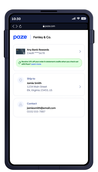
  When enabled, offer messaging also appears inside the Paze checkout experience to reinforce value without interrupting the payment flow.
  </p></br>
</section>
`}</HTMLBlock>

<br />

<HTMLBlock>{`

<section class="section" style="margin-top:-100px;margin-bottom:-50px;">
  <div class="feature ">
    <div class="feature-img">
      <img
        src="https://files.readme.io/6b4360e6c4ea1d5d91974e846d920a61f21044c003d80d540393aa5495e1f618-mobile_messaging_pazeWallet_413x727.png"
        alt="Phone showing"
      />
    </div>
    <div class="feature-text">
      <h3>Inside the Paze Wallet</h3>
      <p>

       Messaging displayed within the Paze wallet during checkout to highlight active offers.
      </p></br>
    </div>
  </div>
</section>
`}</HTMLBlock>

<br />

<HTMLBlock>{`


<style>
  /* ==========================
     Base layout + typography
  ========================== */
  header#content-head {
    display:none;
  }

  .auto-hero {
    text-align: center;
    padding: 0px 20px 40px;
    margin: 0px auto 20px auto;
  }

  .auto-hero h1 {
    font-size: 42px !important;
    font-weight: 700;
    margin-bottom: 24px !important;
    color: #2B2BEE;
  }

  .auto-hero p {
    margin: 0 !important;
    font-size: 19px !important;
    font-style: normal !important;
    font-weight: 400 !important;
    line-height: 28.8px !important;
  }

  .auto-hero-img {
    display: flex;
    justify-content: center;
  }

  .auto-hero-img img {
    max-width: 100%;
    height: auto;
  }

  .section {
    padding: 0 40px;
    margin: 0 auto;
    position: relative;
    overflow: visible;
  }

  .section h2 {
    text-align: center;
    font-size: 32px;
    margin-bottom: 24px !important;
    font-size: 36px !important;
    font-style: normal !important;
    font-weight: 900 !important;
    line-height: 43.2px !important;
    letter-spacing: -1px !important;
  }

  .section-intro {
    text-align: center;
    max-width: 700px;
    margin: 0 auto 60px;
  }
  
  p.section-intro{
    font-size: 24px !important;
    font-style: normal !important;
    font-weight: 400 !important;
    line-height: 120% !important;
  }

  /* ==========================
     Feature rows (phone + text)
     ========================== */
  .feature {
    display: flex;
    align-items: center;
    justify-content: flex-start; /* no extra flex spacing */
    gap: 0;                      /* spacing handled via margins */
    margin-bottom: 20px;
    position: relative;
    overflow: visible !important; /* let purple bar escape */
  }

  .feature.reverse {
    flex-direction: row-reverse;
  }

  .feature-img,
  .feature-text {
    padding: 0;
  }

  .feature-img {
    flex-shrink: 0;
  }

  .feature-img img {
    display: block;
    max-width: 350px;
    height: auto;
    border-radius: 24px;
    margin-left: -20px;
    padding: 120px;
  }

  .feature-text {
    width: 270px;
    max-width: 100%;
  }

  /* Text hugged tighter when phone is on the LEFT */
  .feature .feature-text {
    margin-left: -9% !important;
  }

  /* Text hugged tighter when phone is on the RIGHT */
  .feature.reverse .feature-text {
    margin-right: -10% !important;
  } 

  .feature-text h3 {
    font-size: 20px !important;
    font-style: normal !important;
    font-weight: 700 !important;
    line-height:  28px !important;
    letter-spacing: -0.1px !important;
  }

  .feature-text p {
    font-size: 15px !important;
    font-style: normal !important;
    font-weight: 400 !important;
    line-height: 21px !important;
    letter-spacing: -0.1px !important;
  }

  /* ==========================
     Purple blobs
     ========================== */
  .feature::before,
  .feature::after {
    content: "";
    position: absolute;
    top: 50%;
    width: 360px;
    height: 220px;
    background: #eef0ff;
    transform: translateY(-50%);
    z-index: -1;
  }

  .feature::before {
    left: -160px;   /* left side blob */
    border-radius: 0 90px 90px 0;
  }

  .feature::after {
    right: -80%;
    width: 100%;    /* extends out to the right */
    border-radius: 90px 0 0 90px;
  }

  /* ==========================
     Medium / desktop down
     Stack phone + text earlier
     ========================== */
  @media (max-width: 1190px) {
    .section {
      padding: 0 24px;
    }

    .feature,
    .feature.reverse {
      flex-direction: column;
      align-items: center;
      text-align: center;
    }

    .feature-img img {
      max-width: 420px;
      padding: 90px;
      margin-left: 0;
    }

    .feature-text {
      width: auto;
      max-width: 440px;
      margin: 24px auto 0;
    }

    .feature .feature-text,
    .feature.reverse .feature-text {
      margin-left: 0 !important;
      margin-right: 0 !important;
    }

    /* Remove blobs so they can't overlap */
    .feature::before,
    .feature::after {
      display: none;
    }
  }

  /* ==========================
     Responsive tweaks (phones)
     ========================== */
  @media (max-width: 768px) {
    .section {
      padding: 0 16px;
    }

    .feature,
    .feature.reverse {
      flex-direction: column;
      text-align: center;
    }

    .feature-img img {
      width: 220px;
      margin-left: 0;
      padding: 80px;
    }

    .feature-text {
      margin: 16px auto 0;
      max-width: 360px;
    }

    /* Keep blobs hidden on small screens */
    .feature::before,
    .feature::after {
      display: none;
    }
  }

  /* ==========================
     Scroll + container overrides
     ========================== */

  /* Kill horizontal scroll at viewport edge */
  html,
  body {
    overflow-x: hidden !important;
  }

  /* Let purple bars escape ReadMe’s content wrappers */
  .SuperHubDoc-article3ArTrEavUTKg,
  #content-container,
  .rm-Markdown,
  .rdmd-html,
  .section {
    overflow: visible !important;
  }

  /* Outer content shell shouldn’t scroll sideways either */
  .ContentWithOwlbot-content2X1XexaN8Lf2 {
    -webkit-box-flex: 1;
    -ms-flex: 1 1 auto;
    flex: 1 1 auto;
    min-width: 0;
    overflow-x: hidden;
  }
</style>
`}</HTMLBlock>

<Image src="https://files.readme.io/380bf90edb419c409e0d24327b3d2f7b947830bdf28256976e030e069f2508a7-r&p.svg" align="center" />